Fatigue Science Identity Guidelines
You can familiarize yourself with the Fatigue Science identity guidelines and download brand assets here.
Fatigue Science logo
The primary Fatigue Science logo consists of a wordmark and hook. The hook should always appear in the primary orange, with the word mark in black or white depending on background color. In cases where colour is not available, the logo should be used in all black on light backgrounds or all white on dark backgrounds.
The monogram should only be used in cases of limited space, where the primary Fatigue Science logo legibility would be compromised.
You can download PNG logo files or Vector logo files.

Fatigue Science logo on light background


Fatigue Science logo on dark background

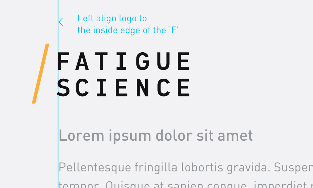
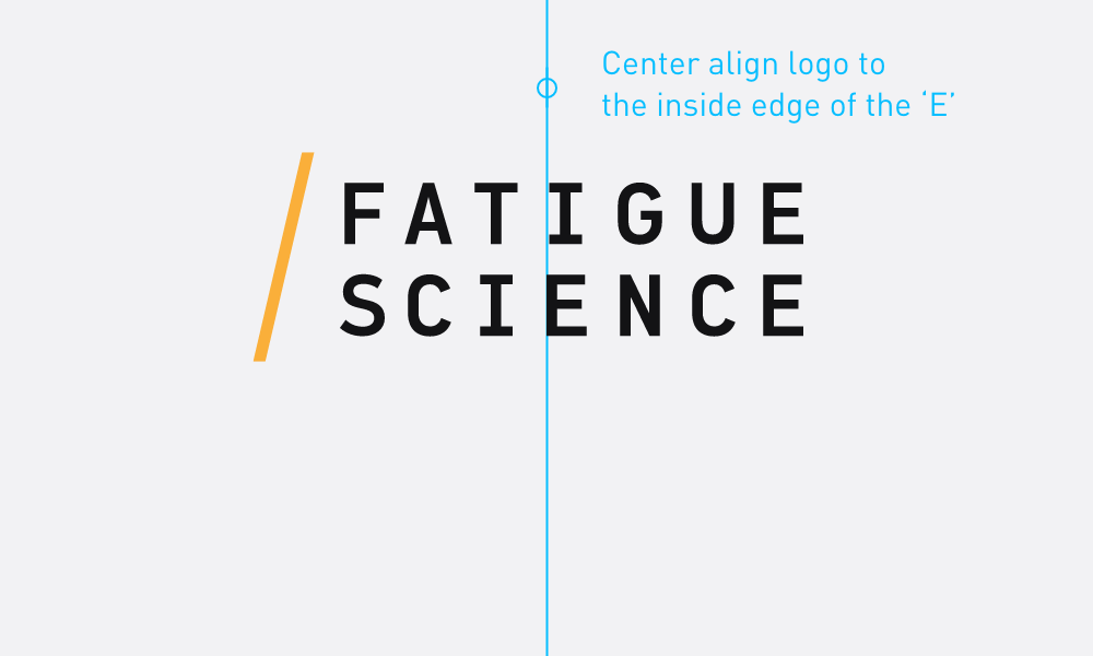
Fatigue Science logo recommended alignment guidelines
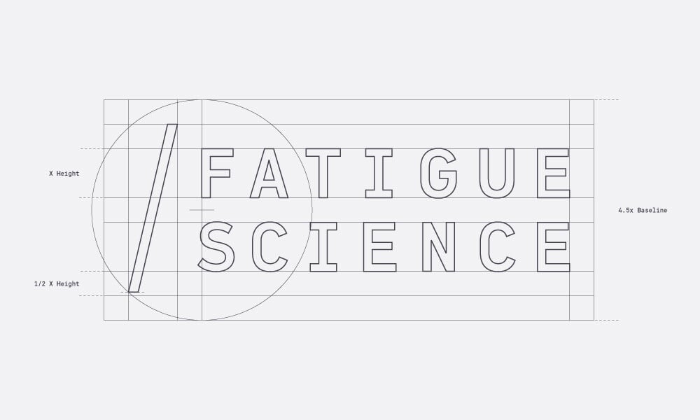
Fatigue Science logo guide. Not for reproduction purposes.

Brand Colors
Primary orange is to be used sparingly as an accent color, never as a large fill or background color.
Refer to the full Fatigue Color Spectrum document for the full color range and values.

Primary Orange
#FFA700

SAFTE Green
#4ACA57

SAFTE Light Green
#86E45B

SAFTE Yellow
#FFE037

SAFTE Orange
#FFAA40

SAFTE Red
#FC564E

SAFTE Dark Red
#D3403F

Cool Gray 1
#F7F6FB

Cool Gray 2
#EFEFF4

Cool Gray 3
#E3E3E9

Cool Gray 4
#CDCBD5

Cool Gray 5
#B0B3BE

Cool Gray 6
#848490

Cool Gray 7
#656570

Cool Gray 8
#454551

Cool Gray 9
#222B30

Cool Gray 10
#141416
Typography
The primary Fatigue Science typeface is DIN Next Pro.

